Wednesday 27 November 2013

Bradfords Animation Festival 2013

Once again the National Media Museum in Bradford opened its doors to talented artists for them to showcase their work. Not only was it BAF's 20th birthday, viewers also got a chance to view amateur artists, art students work and meet talented artists through talks and workshops. Luckily I got to attend a masterclass by Dave Mckean.
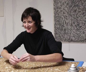
Mckean is said to be a "great renaissance artist for the contemporary era", but what exactly does that mean? Is it his versatile style? He is known his for varying pieces spanning from drawing, painting, sculpture, collage, photography... he has even written some of his own books and directed an original film called 'Luna'. It seems Mckean is unstoppable. He is highly skilled and to the onlooking eye he seems to have it easy, however he made it clear that it has been a challenge for him over the years as he grew himself as an artist and an individual. There is something about Mckean which should be admired. Not only is he talented in many areas, he is also open to try new ideas and grow in the different areas of art and design whilst other artists stick to what they're comfortable with. I believe he inspired many aspiring artists during his talk, along with inspiring myself. I realised that you don't instantly become a pro - rather you need to learn how to grow in that specialist area and overtime you will be rewarded. As they say, practice makes perfect.

(National Media Museum (2013) Bradford Animation Festival. [Online] Available: http://www.nationalmediamuseum.org.uk/bradfordanimationfestival [27/11/13]
National Media Museum (2013) Dave Mckean Masterclass. [Online] Available: http://www.nationalmediamuseum.org.uk/Events/BAF/2013/D/DaveMcKeanMasterclass.aspx [26/11/13])

Tuesday 26 November 2013

Turner Prize 2013


The Turner Prize this year was opened on the 23rd October and, for the first time in history, is being held in Northern Ireland at Ebrington. This years show includes works from the four talented nominees; Laure Prouvost, Tino Sehgal, David Shrigley and Lynette Yiadom-Boakye. 
Prouvost is a London based artist who is known for her unique filmmaking skills which are usually combined with  installation, thus creating unpredictable and atmospheric multimedia pieces. Recently she was awarded the Max Mara art prize for women after her successful exhibition at Whitechapel. Her entry for the Turner Prize this year is an installation piece called Wantee and features a mini set of her grandparents house. It houses numerous pieces which her grandfather made, for example teapots, collages and paintings. Combined with a video, once again, she references her fabricated grandfather and his life - how he one day tried to tunnel to Africa through the floor and never  came back.

'Wantee' installation by Prouvost

Seghal, a British-German artist, differs from all of the other nominees. His work exists only in the viewers memory as he doesn't allow photographs or documentation being done. He focuses on the human form, using movement, language and interaction as his tools. The connection between his subject and the audience also plays a big part in his work, and after past success at the Manchester International Festival, many knew his entry for the Turner Prize was going to be on a similar level. He focuses on exchange in his exhibition, and introduces a 'prize' for each member of the audience who takes part in a conversation. Once again however no documentation is allowed, therefore his piece exists ephemerally only allowing different interpretations and changing opinions of what really happened.
Shrigley's entry for the turner prize sparked a few comments from onlookers. In his exhibition he recreates a life drawing room, along with a illy proportioned model and numerous easels, chalk and  crayons. Like Seghal, Shrigley wants an interaction to occur between his exhibition and the audience as they are allowed to try and draw his sculpture (who is urinating in a bucket) on paper. Many individuals believe it is not his larger than life model which adds life to his entry, rather the audiences responses to his work as they are full of character.
Shrigleys exhibition

Last but not least we come across Yiadom-Boakye, whose paintings are her entry for this years Turner Prize. The subjects in her paintings, although all fictional, all are very similar in one sense. They are all black. However, the different paintings do not link in anyway; one subject or two, bending over or lounging, grinning or not... the only other similarity is that her paintings appear to be androgynous. There is no clear difference between man or woman, thus creating just a figure, allowing interpretations from the audience who view her work. Nevertheless, her characters always seem to be full of life, and the context surrounding them add mystery often intriguing onlookers to find out more.


Although all of the artists are very talented, there can only be one winner. The end date for the Turner Prize is the 5th January 2014.

(Tate (2013) Turner Prize 2013. [Online] Available: http://www.tate.org.uk/whats-on/other-venues/exhibition/turner-prize-2013 [27/11/13]
Tate (2013) Turner Prize 2013 shortlist announced. [Online] Available: http://www.tate.org.uk/context-comment/articles/turner-prize-2013-shortlist-announced) [26/11/13]
The Guardian (2013). The Turner prize 2013 exhibition: go on, get involved. [Online]. Avialable: http://www.theguardian.com/artanddesign/2013/oct/22/turner-prize-2013-exhibition-review [27/11/13])

Monday 25 November 2013

Pablo Picasso - 'Blue period'

During my fine art block I experimented with the use of colour through basic colour sampling. What I discovered however was what colour can represent - whether that through the use of the quantity, the placing on a page or the tone. Picasso, a well known Spanish artist, used colour as his main source of expression frequently in his work (e.g to help him portray certain emotions).  He was said to have gone through five major painting styles in his career which included, his earliest, the 'blue period'.

(Woman with a Helmet of Hair 1904)

Looking at his piece above we can clearly see that blue is the colour which dominates the background and subject herself. Although the subject takes up the majority of the pictorial space the attention is some how drained from her and emitted through the blue tones. Although not a contemporary artist, Picasso is still well respected in our society. His sway away from the natural colours during his numerous colour periods helped him to stand out as an individual, along with his many other talented pieces. The representation of the colour blue in the 21st century is still dullness and uncertainty portraying a certain weakness - blue is however a primary colour making it one of the original three most well known dominant colours. Is is so weak after all? Should we as a society interpret the colour blue for something more powerful after all?

WikiAnswers (2011) How does Picasso use color in his paintings? [Online] Available: http://wiki.answers.com/Q/How_does_Picasso_use_color_in_his_paintings#slide2 [25/11/13]
Wikipedia (2013) Pablo Picasso. [Online] Available: http://en.wikipedia.org/wiki/Pablo_Picasso [25/11/13])

Monday 4 November 2013

Paula Scher


During my brainstorming for my graphics block which explored the use of numbers I came across graphic designer Paula Scher. Scher is a American graphic designer, painter and art educator in design. She is also the first female principal at Pentagram which she joined in 1991(Pentagram is a design studio what does work in graphic designidentityarchitectureinteriors, products and architectural projects).

The piece of her work which lead me to her is called 'Level 5' and is pictured to the left. Although not a traditional graphic piece, it is an installation piece which features a large monochrome number 5 in a basic typeface. The piece is large scale and it dominates the majority of the pictorial space.  The photo of the space seems quite square with solid lines and corners whilst the curves of the five soften the image and create a fluid environments encouraging clashing elements to the piece.
What struck me about her style is that she is more creative in her graphic work. She explores the use of installation/architecture making her style dominant and interesting. Graphics is constantly growing in versatility due to our changing society and being one of the most well known graphic artist has to keep up with contemporary ideas.


(Able. A (2009) Hot Or Not? Level 5 by Paula Scher. [Online]. Available: http://www.apartmenttherapy.com/hot-or-not-level-5-by-paula-sc-73432) [04/11/13]
Image: https://blogger.googleusercontent.com/img/b/R29vZ2xl/AVvXsEiWgSoRQk9oC4niIpgMliFPQmNYbekWPGdJXWX-h7sG5puU9hWo5lHGnTZnTkm3bvnKBrOMLi2D-hRbzCKmA4gdQnbcu3FSvsqk3AnnjwsSwzDu6HLIJCtyLLwuWhro1FDp1u_Pgq7Y9P4A/s400/5_5.JPG [31/10/13]
Wikipedia (2013) Paula Scher. [Online] Available: http://en.wikipedia.org/wiki/Paula_Scher [01/11/13])

Tuesday 22 October 2013

Tara Donovan


During my 3D block I came across Tara Donovan, a site specific American artist who uses everyday items to create highly detailed pieces of work.  Her large scale sculptures feature an item which is usually multiplied and repeated, such as the use of numerous straws or styrofoam cups. As my brief was to reuse found objects, and as I had found numerous mini white cups, I decided to work in a similar style to her. In the end I ended up creating a large 3D sculpture out of mini white sauce cups which I hung from a blank white wall.
Below is one of Donovan's pieces which stood out for me. It is also the piece which influenced my work the most. 'Untitled' was done in 2003 and features many cups which are attached together. Her use of a simple repetition technique creates something deeply complicated of what would be a simple singular object. The overall look of this sculpture is organic as it seems to flow and grow out of one another - somewhat looking like a microorganism of some sort. Her use of lighting in this photographs makes it look clean and fresh and due it its large scale takes up all of the pictorial space of the photograph. 


Donovan is one of the artists so far who has really captured my interest and I would like to explore more of her unique styles in 3D contemporary art and design. her work has not only informed me that a simple object can be made into something complicated due to the sue of repetition, but she has also opened my eyes to the mentally stimulating world of 3D.


Wikipedia (2013) Tara Donovan. [Online] Available: http://en.wikipedia.org/wiki/Tara_Donovan [22/10/2013] 

Image: http://blog.art21.org/wp-content/uploads/2010/04/DONOVAN_portrait_2005_v1-e1270734564405.jpg [22/10/2013]

Image: http://www.acegallery.net/artists/donovan/TD-UntCupsD.jpg [22/10/2013]

Monday 21 October 2013

Sarah Lucas


“Where’s it all going? What are we fucking up to, if anything, that we all think is so important?”
(Sarah Lucas, 1996)

I first came across Sarah Lucas's work during my textile block and was captured by her highly provocative work. I was introduced to her because of her use of furniture in some of her earlier works which portrayed visual puns of a sexual nature. My work within the textile block didn't represent bawdy or explicit representations of the human form, instead I linked the two due to the use of furniture. Whilst Lucas uses everyday objects to create a piece of art, I created an everyday item out of a piece of fashion. 
Lucas is an English artist and is a part of the Young British Artists who first emerged during the 1990s and her work has been likened to other artists such as Francis Bacon and Damien Hirst. To the left is a self portrait of herself called 'Fighting Fire with Fire'. This piece of work was part of a series of twelve photographic self portraits in which she challenges the stereotypes of gender and sexuality. We see her in a masculine 'macho' pose yet she still looks defiantly feminine. Another one of her pieces is to the right. 'Mamum', a 3D piece is made out of pairs of tights which are filled creating the image of numerous womens breasts. This not only is not a surprise, as Lucas's work is usually quite controversial, but also gives a sense of solid femininity. Tights are used daily by women and to be filled to create a solid structure gives a sense of rigidness and power. Nevertheless, the complete structure is organic. Not only is the piece flowing, the limited palette of natural colours could be said to represent an earthy well grounded woman of the 21st century. A woman which Lucas repeatedly tries to portray.
Collectively I like Lucas's style, she not only addresses issues such as misogyny whilst criticising narrow minded thoughts, she also creates stimulating ideas - her audience can interpret, reflect and ask questions which arise in contemporary society.

Burrows, W (2009) Sarah Lucas [Online]. Available: http://wayneburrows.wordpress.com/sarah-lucas/ [21/10/13]

Stonard, JP (2000) Sarah Lucas, Artist biography [Online]. Available: http://www.tate.org.uk/art/artists/sarah-lucas-2643 [21/10/13]


Tuesday 8 October 2013

Modern Painters (September 2013)


As my last review covered the topic of Fine Art and Fashion, I decided I would look at a article which focused on Fine Art. I found an article in Modern Painters on Tatiana Blass, a Brazilian artist who focuses on allegories of the break down of communication.
I looked at a screen shot of one of her video pieces produced during 2012. It featured two actresses who were sat in the middle of a white room with tons of spools of different thread attached to them. This takes up a large area and creates an artificial ordered setting. They then decide to move about and create a colourful web of thread in which they cannot escape. This disrupts the order and makes it more of an disturbed asymmetric setting caused by random movements. The screen then ends on dialogue spoken by one of the actresses, "We are in real trouble".
Whilst I do like this piece I don't fully understand her thought process behind it. Nora Abrams, an associate curator at the Museum of Contemporary Art, claims that Blass poses "questions that her work tries to answer", but what her question was for this piece I have yet to understand. Nevertheless, her use of everyday spools being disrupted is a simple yet successful finished piece of contemporary art.

(Hanson, S.P. (2013) 'Waxing Poetic', Modern Painters, September 2013. 

Vimeo (2012) [Online] Avialable:  http://b.vimeocdn.com/ts/353/110/353110207_640.jpg [8th October 2013] )

Monday 7 October 2013

Frieze (No.158 October 2013) Review

I went on and looked at Frieze. In this I found an article on Alan Reid, a New York based artist who combines Fine Art and Fashion into one. He creates "paintings of fashion". Reid likes to paint models and clothing - sometimes references to sex and poetry are present in his work too. 
To the left is one of his canvas (1.7 x 1.2m) pieces done with acrylic and foamcore. Only one subject is present and she is taking up the centre of the pictorial space. She dominates the scene even though both the background colour and her skin tone have an equal light intensity - causing her to somewhat blend into the pale pink exterior. Due to its lighting the image is soft and seductive which her face expression also exerts. Basic line drawings are used for the details of her dress which is the only thing which is monochrome with two cartoon croissants accompanying it.
 I believe the two different aspects of the canvas painting, the realistic fine art painting of the woman and her abstract piece of clothing (fashion), successfully merge and work together well. Reid proves that within contemporary art different aspects over-cross and one doesn't have to stick rigidly to traditional art forms. Reid himself believes that fashion and paintings are dependent on each other rather than being mutually exclusive.
(Howe, D.E. (2013) 'In Focus: Alan Reid', Frieze, Issue 158)

Tuesday 1 October 2013

Novum 10.13 Visual Communication


For my 6th review I looked at  an article on Iwona Przybyla which was in Novum. Iwona creates typographical embroidery (a series of 3D letters organized out of string). She placed this series in a book of hers, which to her surprise, was a huge success. She received positive reactions from everyone who saw the book and was acquired by the Museum Meermanno in Den Haag. Her work is on a smaller scale and is interactive. The letters are geometric in their finished product and normally consist of only one colour on a white pictorial space. Due to the books complex mechanics it appears to be very ordered and mathematical however this is not the case. Iwona is what I would call a very confident artist. She doesn't plan what she is going to do and disregards methodical methods. Instead she 'goes with the flow' - "she realised that experimentation is always the better way".


(Image http://www.designboom.com/weblog/images/images_2/lara/818_images/iwona_90_degree_typography/90%C2%B0_typography08.jpg [01/10]13])

Monday 30 September 2013

Crafts (#244 September/October) Review


I revisited the 3D aspect of contemporary art and design by looking at the magazine 'Crafts'. I found an article on ceramist Jennifer Lee called 'Pots that talk of what lies beneath'. This article reviews Lee's new pieces of work which will be shown in London for the first time in five years. Lee's work is made from clay - each one differing in its components whether it be stoneware or different metal oxides. When creating these 3D sculptures she likes the think of the different clays of having an exterior and interior, rather than thinking that they have different surfaces. For her, she says, the vessels are doing "different things". Her work is labour intensive and is time baring however this helps her pieces "speak of time and subtleties". To me, her work is aesthetically pleasing to the human eye due to their natural colours and organic fluid shapes. Her sculptures look simple and not too 'busy' allowing a promoting a calming effect on the audience. Also due to the age of some of the pieces have a worn look to them creating a fading of some of the colours and merging of the different components - some of Lees work which will be shown in London from 9th October age back to the 80s! To her though it is about quality rather than quantity. Compared to twenty years ago shh was making them more quickly, her focus now is getting them "right".

Saturday 28 September 2013

ID (#326) 'Is the internet the new streets?'

I then looked at ID for my forth blog entry and reviewed the article 'Is the internet the new streets?' by Dean Kissick. I grouped this under the 'visual communication' topic heading as the article focused on how photography/fashion has grown drastically over the internet... in turn resulting in a massive shift in them industries due to sites such as Tumblr. The article didn't focus solely on one contributor therefore I decided to pick one from the numerous names mentioned and do some of my own research into how they might have contributed to contemporary art through the use of the internet. Proenza Schouler, a leading womanswear brand based in New York, are described as being the "masters of digital marketing". This is because they were seen to highly maximise their opportunities through their use of YouTube video commissions. In their spring/summer 2013 collection there were numerous brightly coloured photo-prints which they believed represented the internet itself. As there were no photos present in this article I decided to look up this specific collection (photos below)


Along with the vast array of colours present in this specific collection there are numerous different patterns used which allows consumers to create their own look. Whilst the top photo illustrates very geometric ordered patterns and shapes used, the bottom has a more fluid look to it and has more of a natural feel to it. As many of the clothing in the spring series do all reflect individuality provides a good Zeitgeist for what it is trying to portray (the clothing produced is so diverse that it successfully reflects how diverse the internet is in itself and how diverse its consumers are). The internet is such a big part in 21st century culture, especially for the youth of today. It allows individuals to express themselves through 'selfies', provides fashion industries the power to promote their artwork/clothing on numerous websites and helps fuel photography based art as photographs are plastered on pretty much every webpage out there. In my eyes the internet has had a positive impact on contemporary art - "It's changed the way we dress, the way we look at ourselves and what we aspire to be". The internet is an ever-changing network which reflects our every changing society.

Tuesday 24 September 2013

Textile Forum (3/2013 September Copy)

For my third entry I looked at 'Textile Forum' which focuses on the use of textiles within contemporary art and design. I cam across an article on Toshiko Horiuchi Macadam, a Japanese artist who is part of the 'fiberarts' movement. People who are a part of the 'fiberarts' movement are known for their love of experiment, and when children took a great interest in one of Horiuchis  pieces it opened up her mind to new ideas - "she discovered that art is suitable for practical use" too!
 

Above is a photo of one of the children's playground she created after she was inspired by the interaction of youngsters in her previous work. Horiuchi creates these interactive textile sculptures through the use of knitting and crotchet. As she knits, the use of repeat pattern is apparent and a wide array of colours are used to help capture the children's attention. The scale of her 'playground' pieces are large enough for numerous children to play on at once and durable showing a use of flexible  material used to help withstand large amounts of strain (the Hakone play sculpture was used by approximately 6000 children each day!). Horiuchis  sculptures appear ordered and mathematical, even though she is known for her experimental ideas, as a certain element of safety is needed to be suitable for interactions from children. However, regardless of her work being random or not, I do believe these numerous works are very successful. Not only does she give back to the community by bringing joy to the younger generations but she also got the opportunity to showcase her art work and present her impressive ideas on how art can be appreciated in numerous ways.

(KnitJapan. http://www.knitjapan.co.uk/features/c_zone/horiuchi/work.htm [24/09/13] )

Tuesday 17 September 2013

Art Monthly (issue #369)


For my second blog entry I decided I would look at Art Monthly #369, a popular magazine which explores the 'Fine Art' subheading within contextual art and design. I came across a profile article based on Pratchaya Phinthong, a current artist who lives and works in Bangkok. His work is described as being full of "political stories, historical stories" and "stories of real peoples lives". One of his exhibitions which is one of his most recent is pictured to the right and links to the notion of his work depicting "historical stories". The skull, known as the 'Broken Hill' skull was a great inspiration to Phinthong and he used this as a starting point to base his commission on whilst he travelled. He also used this skull, which is actually a replica of the first early human fossil found in Africa, in one of his exhibitions as part of a performance piece with the man in the photo. The man present in the photograph is not Phinthong himself but a man called Kamfwa Chisala, a Zambian museum guide who travels where ever the exhibition goes. As far as analysis's go, the skull itself is life size as it is a replica of a real human skull which was found. Visually I believe this performance piece works successfully - Chisala would not only speak to the audience whilst presenting the skull as the inspiration for his other works in his exhibition, he would also present it as an original performance piece of art (therefore it served a double purpose). Phinthong's use of historical links also acts as a positive as many people will be interested in the history and stories behind the 'Broken Hill Skull' (it has been used to supports Darwin's theory of evolution). Nevertheless, as a single piece of performance art I believe it's at its weakest, and due to the fact that the skull was not made/constructed  by Phinthong himself it has its limitations. Some of the audience may nitpick Phinthong for using something which wasn't a piece of original art in his exhibition and may think its a weak attempt at a performance piece. Maybe only when placed inside the 'Broken Hill' exhibition does it really project the power it holds and can't be criticised so easily?

Monday 16 September 2013

First entry ! Ceramic Review (issue #263)

 For my first entry I looked at 'Ceramic Review' (issue #263) which focuses on the 3D aspects of contemporary art and design. I came across an article on the Gardiner Museum in Toronto, and although it didn't focus solely on one particular artist/designer, it explored the idea of contemporary jewellery. The review, called 'A bit of clay on the skin: new Ceramic Jewellery', explores the idea of using 3D ceramic (usually porcelain) pieces of art which artists such as Marie Pendariès and Peter Hoogeboom transform into wearable fashion accessories. Hoogeboom, whose work is presented to the left ('Spanish Collar'), was one of the primary jewellers who distinguished himself through the use of porcelain. His work resembles ancient pieces of jewellery which were forgotten for centuries, and because of this his work can be said to help "bridge the past to the present". Not only do I find his way of working (and other artists who embrace the use of ceramic jewellery)  intriguing because it's so out of the ordinary, I also find his work inspiring... He successfully links his work to history/ past societies whilst also creating a beautiful add on for the human silhouette. I do however believe that this type of work should stick to acting only as an art statement whilst "integrating everlasting questions about the human condition and the world". I don't think a high street shop selling a large porcelain collar would go down well, the only thing I guess it would add to is a persons 'individuality'...